The Oregon Fix - Part 8

Part 8: The High Level Overview
Its probably time to admit that while I have used statistics in my occupation for many years, I am not originally a statistician by training. I have been honest in how I have presented this data and I’ve found that when the data is presented honestly in graphical form, most people have an innate sense of what is normal and what is unusual, so I’ve made use of a lot of graphs in these presentations. I also have detailed when the voting in each county has crossed the line into a statistical aberration. Here is a summary of what has been uncovered in this analysis.
From 1988 through 2016 twenty-three counties have consistently registered and voted more and more republican, five counties have consistently registered and voted more and more democratic, and eight counties have sometimes trended more democrat, and sometimes more republican. These are depicted in the map below:
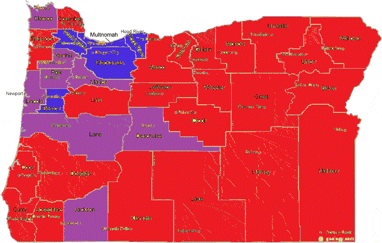
Just to make it clear, the breakdown of the population in these counties is opposite of their land area:
The 5 democratic counties contained 46.5% of the voters in 2020. The 8 no trend counties contained 33.9% of the voters in 2020. The 23 republican trending counties contained 19.6% of the voters in 2020
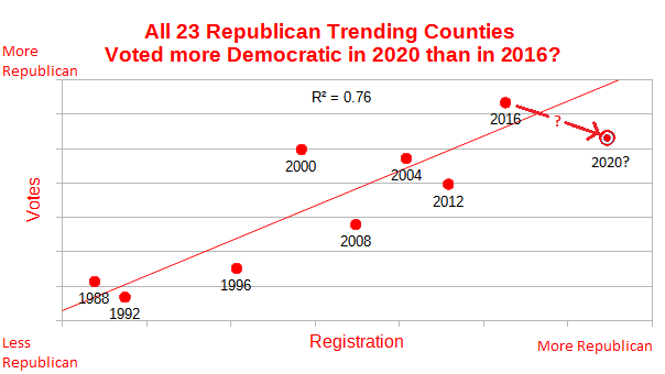
Of the twenty-three counties which registered more republican since 1988, they all voted more democratic for president than would be expected in 2020, and seventeen of them so much so that it would be called a statistical anomaly. Here is a graph depicting the total registration and vote trends for these 23 counties:
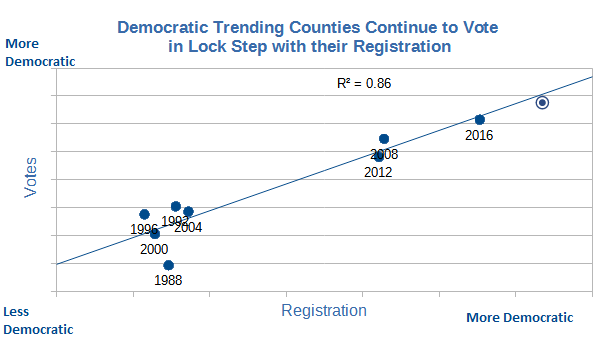
Of the five democratic trending counties, there was relatively little variation. Only one county, Multnomah, showed any statistical aberration in their voting for president in 2020, voting slightly more republican than expected after many years of consistently voting with their registration. Here is the graphical depiction of the total registration and vote behavior for those 5 counties over the years.
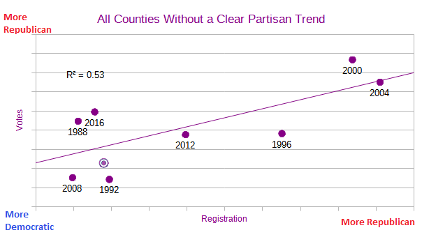
The eight counties which were not clearly trending toward either party also did not show a strong correlation between registration and voting over these nine elections. Once again, only one of these counties showed any statistical aberration in the 2020 presidential election. That county was Deschutes who voted more democratic than expected despite a large amount of variation over the years. The summary graph for these eight counties is shown below:
A patriot’s prayer: Father God, You know all of this stuff, and if I had all knowledge as you do, it would seem quite trivial to me, but you are a kind and compassionate God, and since it affects your children it is important to you. I will just ask again, use this information to guide us to the next step and the next until we take the action you want us to take.
Click here to see the previous article Part 7: The Battleground Counties.