The Oregon Fix - Part 2

Part 2: What should we have expected from 2020?
In Part 1 we see that the tools are in place for fraud to be committed in the 2020 general election. How can we know what the actual vote count was and what should have happened in 2020? The only way to know for sure is to conduct a rigorous full forensic audit, but the secretary of state has directed county clerks to only do the state approved audits. Polls might give us some indication, but polling organizations have been notoriously unreliable predictors of election results of late, and conducting our own poll would be out of the question for such a relatively small group of patriots. We have however looked at voter registration trends as a predictor for how many votes would be generated for that party’s candidate. Registrations might give us some indication if it has forecast past election results well.
Across the US, elections are to be conducted by county officials and only supervised and compiled by the state. In Oregon we have 36 counties, varied in geography, population and political character. It can be very confusing to look at all 36, but let’s look at two counties of similar size whose political make up are near opposites. We will look at the presidential race because we are all familiar with the dynamics of those elections over the years. Here are plots of registration and vote totals for Morrow county, a sparsely populated county in the northeast part of the state, and Hood River county, a somewhat rural county just east of Portland.
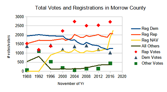
There’s a lot that can be inferred from this graph, but we are looking to see if the registrations (solid red and blue lines) move up and down with the vote totals (red diamonds and blue triangles). There appears to be a little bit of a trend, but there are so many lines on the graph that the data is confusing and unclear. It doesn’t look like the sudden rise of the number of NAV voters greatly affected the vote in 2016. The 2020 election results aren’t plotted yet on this graph because we are just trying to discern if we can see the registrations and votes moving together.
{For the statisticians reading this, the correlation coefficient between registrations and votes is about 0.89 for the republican party (pretty good correlation), and about 0.47 for the democratic party (not so good). }
Looking at Hood River county you see that unlike Morrow county, democratic registrations and voting patterns are on the increase and republicans are decreasing. You can see that the democratic registrations and voting both move up consistently here. On the other hand the republican registrations are mostly flat while the voting goes down then up and then down again inconsistently.
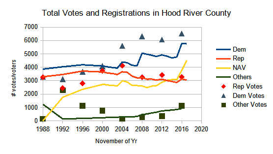
{Statisticians: The correlations coefficients for the democratic registration to votes is 0.89, but only about 0.10 for the republican numbers.}
What you can say from this is that the voting for the dominant party in each county (republican in Morrow and democrat in Hood River) follows the registrations pretty well. But we need to be able to use that information to predict what we would expect to happen in 2020. So far, we see more confusion than correlation. But in part 3 we will try to present the data in a way that we can see the trend in each county in a much more clear fashion.
A Patriot’s prayer: Lord our enemy is the author of confusion. Bring clarity in our understanding to combat that confusion.
Part 3: A simpler way to see the registrations and votes move together.